Table of contents
Mantid now can use Matplotlib to produce figures. There are several advantages of using this software package:
While Matplotlib is using data arrays for inputs in the plotting routines, it is now possible to also use several types on Mantid workspaces instead. For a detailed list of functions that use workspaces, see the documentaion of the mantid.plots module.
This page is intended to provide examples about how to use different Matplotlib commands for several types of common task that Mantid users are interested in.
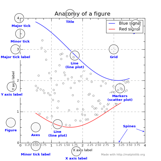
To understand the matplotlib vocabulary, a useful tool is the “anatomy of a figure”, also shown below.
(Source code, png, hires.png, pdf)
Here are some of the highlights:
There are two main ways that one can visualize images produced by matplotlib. The first one is to pop up a window with the required graph. For that, we use the show() function of the figure.
import matplotlib.pyplot as plt
fig,ax=plt.subplots()
#some code to generate figure
fig.show()
If one wants to save the output, the figure object has a function called savefig. The main argument of savefig is the filename. Matplotlib will figure out the format of the figure from the file extension. The ‘png’, ‘ps’, ‘eps’, and ‘pdf’ extensions will work with almost any backend. For more information, see the documentation of Figure.savefig Just replace the code above with:
import matplotlib.pyplot as plt
fig,ax=plt.subplots()
#some code to generate figure
fig.savefig('plot1.png')
fig.savefig('plot1.eps')
Sometimes one wants to save a multi-page pdf document. Here is how to do this:
import matplotlib.pyplot as plt
from matplotlib.backends.backend_pdf import PdfPages

with PdfPages('/home/andrei/Desktop/multipage_pdf.pdf') as pdf:
    #page1
    fig,ax=plt.subplots()
    ax.set_title('Page1')
    pdf.savefig(fig)
    #page2
    fig,ax=plt.subplots()
    ax.set_title('Page2')
    pdf.savefig(fig)
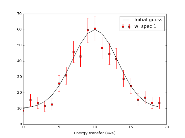
For matrix workspaces, if we use the mantid projection, one can plot the data in a similar fashion as the plotting of arrays in matplotlib. Moreover, one can combine the two in the same figure
from __future__ import division
import numpy as np
import matplotlib.pyplot as plt
from mantid import plots
from mantid.simpleapi import CreateWorkspace

# Create a workspace that has a Gaussian peak
x = np.arange(20)
y0 = 10.+50*np.exp(-(x-10)**2/20)
err=np.sqrt(y0)
y = 10.+50*np.exp(-(x-10)**2/20)
y += err*np.random.normal(size=len(err))
err = np.sqrt(y)
w = CreateWorkspace(DataX=x, DataY=y, DataE=err, NSpec=1, UnitX='DeltaE')

# Plot - note that the projection='mantid' keyword is passed to all axes
fig, ax = plt.subplots(subplot_kw={'projection':'mantid'})
ax.errorbar(w,'rs') # plot the workspace with errorbars, using red squares
ax.plot(x,y0,'k-', label='Initial guess') # plot the initial guess with black line
ax.legend() # show the legend
#fig.show()
(Source code, png, hires.png, pdf)
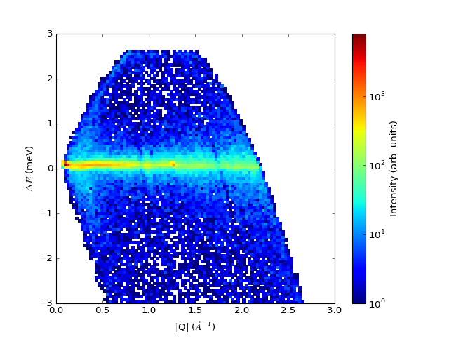
Some data should be visualized as two dimensional colormaps
import matplotlib.pyplot as plt
from mantid import plots
from mantid.simpleapi import Load, ConvertToMD, BinMD, ConvertUnits, Rebin
from matplotlib.colors import LogNorm

# generate a nice 2D multi-dimensional workspace
data = Load('CNCS_7860')
data = ConvertUnits(InputWorkspace=data,Target='DeltaE', EMode='Direct', EFixed=3)
data = Rebin(InputWorkspace=data, Params='-3,0.025,3')
md = ConvertToMD(InputWorkspace=data,
                 QDimensions='|Q|',
                 dEAnalysisMode='Direct')
sqw = BinMD(InputWorkspace=md,
            AlignedDim0='|Q|,0,3,100',
            AlignedDim1='DeltaE,-3,3,100')

#2D plot
fig, ax = plt.subplots(subplot_kw={'projection':'mantid'})
c = ax.pcolormesh(sqw, norm=LogNorm())
cbar=fig.colorbar(c)
cbar.set_label('Intensity (arb. units)') #add text to colorbar
#fig.show()
(Source code, png, hires.png, pdf)
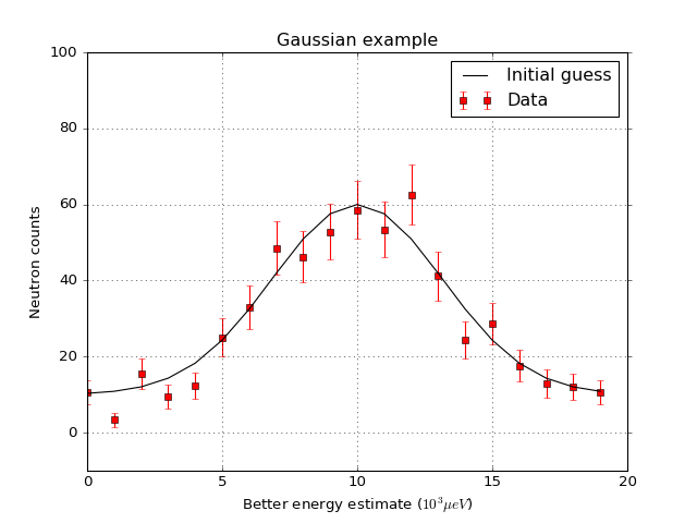
One can then change properties of the plot. Here is an example that changes the label of the data, changes the label of the x and y axis, changes the limits for the y axis, adds a title, change tick orientations, and adds a grid
from __future__ import division
import numpy as np
import matplotlib.pyplot as plt
from mantid import plots
from mantid.simpleapi import CreateWorkspace

# Create a workspace that has a Gaussian peak
x = np.arange(20)
y0 = 10.+50.*np.exp(-(x-10.)**2/20.)
err=np.sqrt(y0)
y = 10.+50*np.exp(-(x-10)**2/20.)
y += err*np.random.normal(size=len(err))
err = np.sqrt(y)
w = CreateWorkspace(DataX=x, DataY=y, DataE=err, NSpec=1, UnitX='DeltaE')

# Plot - note that the projection='mantid' keyword is passed to all axes
fig, ax = plt.subplots(subplot_kw={'projection':'mantid'})
ax.errorbar(w,'rs', label='Data')
ax.plot(x,y0,'k-', label='Initial guess')
ax.legend()
ax.set_xlabel('Better energy estimate ($10^3\mu eV$)')
ax.set_ylabel('Neutron counts')
ax.set_ylim(-10,100)
ax.set_title('Gaussian example')
ax.tick_params(axis='x', direction='in')
ax.tick_params(axis='y', direction='out')
ax.grid(True)
#fig.show()
(Source code, png, hires.png, pdf)
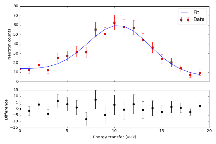
Let’s create now a figure with two panels. In the upper part we show the workspace as above, but we add a fit, In the bottom part we add the difference.
from __future__ import division
import numpy as np
import matplotlib.pyplot as plt
from mantid import plots
from mantid.simpleapi import CreateWorkspace, Fit

# Create a workspace that has a Gaussian peak
x = np.arange(20)
y0 = 10.+50*np.exp(-(x-10)**2/20)
err=np.sqrt(y0)
y = 10.+50*np.exp(-(x-10)**2/20)
y += err*np.random.normal(size=len(err))
err = np.sqrt(y)
w = CreateWorkspace(DataX=x, DataY=y, DataE=err, NSpec=1, UnitX='DeltaE')
result = Fit(Function='name=LinearBackground,A0=10,A1=0.;name=Gaussian,Height=60.,PeakCentre=10.,Sigma=3.',
             InputWorkspace='w',
             Output='w',
             OutputCompositeMembers=True)
# The handle to the output workspace is result.OutputWorkspace. The first spectrum is the data,
# the second is the fit, the third is the difference. Subsequent spectra are the calculated
# functions of each of the components of the fit (here LinearBackground and Gaussian)
# Note that the difference spectrum has 0 errors. One can copy the errors from data
result.OutputWorkspace.setE(2,result.OutputWorkspace.readE(0))

#do the plotting
fig, [ax_top, ax_bottom] = plt.subplots(figsize=(9, 6),
                                        nrows=2,
                                        ncols=1,
                                        sharex=True,
                                        gridspec_kw={'height_ratios':[2,1]},
                                        subplot_kw={'projection':'mantid'})

ax_top.errorbar(result.OutputWorkspace,'rs',wkspIndex=0, label='Data')
ax_top.plot(result.OutputWorkspace,'b-',wkspIndex=1, label='Fit')
ax_top.legend()
ax_top.set_xlabel('')
ax_top.set_ylabel('Neutron counts')
ax_top.tick_params(axis='both', direction='in')
ax_bottom.errorbar(result.OutputWorkspace,'ko',wkspIndex=2)
ax_bottom.tick_params(axis='both', direction='in')
ax_bottom.set_ylabel('Difference')
fig.tight_layout()
#fig.show()
(Source code, png, hires.png, pdf)
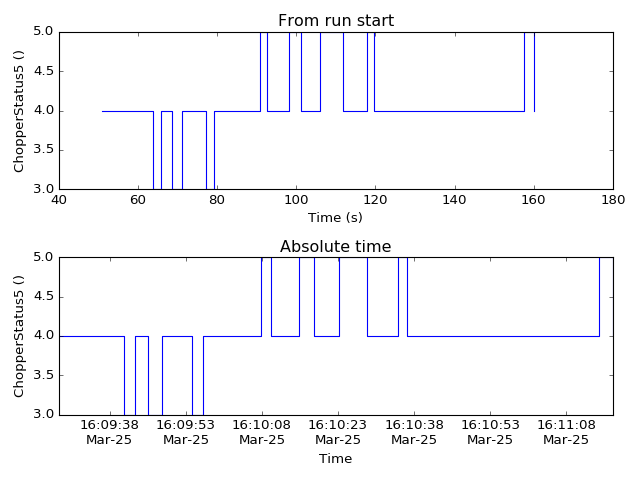
The mantid.plots.MantidAxes.plot function can show sample logs. By default, the time axis represents the time since the first proton charge pulse (the beginning of the run), but one can also plot absolute time using FullTime=True
import matplotlib.pyplot as plt
from mantid import plots
from mantid.simpleapi import Load

w=Load('CNCS_7860')
fig = plt.figure()
ax1 = fig.add_subplot(211,projection='mantid')
ax2 = fig.add_subplot(212,projection='mantid')
ax1.plot(w, LogName='ChopperStatus5')
ax1.set_title('From run start')
ax2.plot(w, LogName='ChopperStatus5',FullTime=True)
ax2.set_title('Absolute time')
fig.tight_layout()
#fig.show()
(Source code, png, hires.png, pdf)
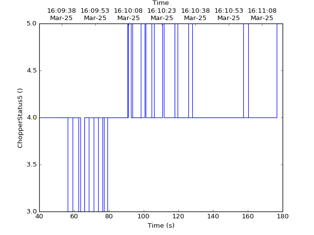
Note that the parasite axes in matplotlib do not accept the projection keyword. So one needs to use mantid.plots.plotfunctions.plot instead.
import matplotlib.pyplot as plt
from mantid import plots
from mantid.simpleapi import Load
w=Load('CNCS_7860')
fig, ax = plt.subplots(subplot_kw={'projection':'mantid'})
ax.plot(w,LogName='ChopperStatus5')
axt=ax.twiny()
plots.plotfunctions.plot(axt,w,LogName='ChopperStatus5', FullTime=True)
#fig.show()
(Source code, png, hires.png, pdf)
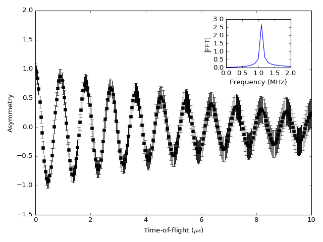
One common type of a slightly more complex figure involves drawing an inset.
import matplotlib.pyplot as plt
import numpy as np
from mantid import plots
from mantid.simpleapi import CreateWorkspace, FFT
from matplotlib import rcParams
import warnings

x=np.linspace(0,10,250)
y=np.cos(2*np.pi*1.1*x)*np.exp(-x/7.)
err=np.sqrt(0.01+x/200.)
w=CreateWorkspace(x,y,err,UnitX='tof')
fft=FFT(w)

# make all ticks point in
rcParams['xtick.direction'] = 'in'
rcParams['ytick.direction'] = 'in'

fig, ax = plt.subplots(subplot_kw={'projection':'mantid'})
ax.errorbar(w,'ks')
ax.set_ylabel('Asymmetry')
ax.set_ylim(-1.5,2)
ax_inset=fig.add_axes([0.7,0.72,0.2,0.2],projection='mantid')
ax_inset.plot(fft,specNum=6)
ax_inset.set_xlim(0,2)
ax_inset.set_xlabel('Frequency (MHz)')
ax_inset.set_ylabel('|FFT|')
# note that thight_layout will produce a warning here "This figure includes
# Axes that are not compatible with tight_layout, so its results might be incorrect."
with warnings.catch_warnings():
    warnings.simplefilter("ignore", category=UserWarning)
    fig.tight_layout()
#fig.show()
(Source code, png, hires.png, pdf)
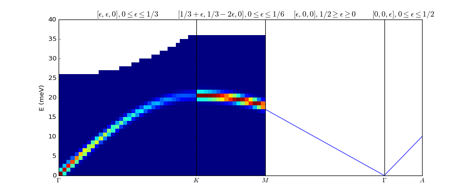
Plotting dispersion curves on multiple panels can also be done using matplotlib:
import matplotlib.pyplot as plt
import numpy as np
from matplotlib.gridspec import GridSpec
from mantid.simpleapi import CreateMDHistoWorkspace
from mantid import plots

# Generate nice (fake) dispersion data
# Gamma to K
q = np.arange(0,0.333,0.01)
e = np.arange(0,60)
x,y = np.meshgrid(q,e)
omega_hh = 20. * np.sin(np.pi*x*1.5)
I_hh = np.exp(-x*5.)
signal = I_hh * np.exp(-(y-omega_hh)**2)
signal[y>25+100*x**2]=np.nan
ws1=CreateMDHistoWorkspace(Dimensionality=2,
                           Extents='0,0.3333,0,60',
                           SignalInput=signal,
                           ErrorInput=np.sqrt(signal),
                           NumberOfBins='{0},{1}'.format(len(q),len(e)),
                           Names='Dim1,Dim2',
                           Units='MomentumTransfer,EnergyTransfer')
# K to M
q = np.arange (0.333,0.5, 0.01)
x,y = np.meshgrid(q,e)
omega_hm2h=20. * np.cos(np.pi*(x-0.333))
signal = np.exp(-(y-omega_hm2h)**2)
signal[y>35]=np.nan
ws2=CreateMDHistoWorkspace(Dimensionality=2,
                           Extents='0.3333,0.5,0,60',
                           SignalInput=signal,
                           ErrorInput=np.sqrt(signal),
                           NumberOfBins='{0},{1}'.format(len(q),len(e)),
                           Names='Dim1,Dim2',
                           Units='MomentumTransfer,EnergyTransfer')


d=6.7
a=2.454
#Gamma is (0,0,0)
#A is (0,0,1/2)
#K is (1/3,1/3,0)
#M is (1/2,0,0)
gamma_a=np.pi/d
gamma_m=2.*np.pi/np.sqrt(3.)/a
m_k=2.*np.pi/3/a
gamma_k=4.*np.pi/3/a

fig=plt.figure(figsize=(12,5))
gs = GridSpec(1, 4,
              width_ratios=[gamma_k,m_k,gamma_m,gamma_a],
              wspace=0)

ax1 = plt.subplot(gs[0],projection='mantid')
ax2 = plt.subplot(gs[1],sharey=ax1,projection='mantid')
ax3 = plt.subplot(gs[2],sharey=ax1)
ax4 = plt.subplot(gs[3],sharey=ax1)

ax1.pcolormesh(ws1)
ax2.pcolormesh(ws2)
ax3.plot([0,0.5],[0,17.])
ax4.plot([0,0.5],[0,10])


#Adjust plotting parameters

ax1.set_ylabel('E (meV)')
ax1.set_xlabel('')
ax1.set_xlim(0,1./3)
ax1.set_ylim(0.,40.)
ax1.set_title(r'$[\epsilon,\epsilon,0], 0 \leq \epsilon \leq 1/3$')
ax1.set_xticks([0,1./3])
ax1.set_xticklabels(['$\Gamma$','$K$'])
#ax1.spines['right'].set_visible(False)
ax1.tick_params(direction='in')

ax2.get_yaxis().set_visible(False)
ax2.set_xlim(1./3,1./2)
ax2.set_xlabel('')
ax2.set_title(r'$[1/3+\epsilon,1/3-2\epsilon,0], 0 \leq \epsilon \leq 1/6$')
ax2.set_xticks([1./2])
ax2.set_xticklabels(['$M$'])
#ax2.spines['left'].set_visible(False)
ax2.tick_params(direction='in')

#invert axis
ax3.set_xlim(1./2,0)
ax3.get_yaxis().set_visible(False)
ax3.set_title(r'$[\epsilon,0,0], 1/2 \geq \epsilon \geq 0$')
ax3.set_xticks([0])
ax3.set_xticklabels(['$\Gamma$'])
ax3.tick_params(direction='in')

ax4.set_xlim(0,1./2)
ax4.get_yaxis().set_visible(False)
ax4.set_title(r'$[0,0,\epsilon], 0 \leq \epsilon \leq 1/2$')
ax4.set_xticks([1./2])
ax4.set_xticklabels(['$A$'])
ax4.tick_params(direction='in')
#fig.show()
(Source code, png, hires.png, pdf)