Displaying 2D Data
Plotting All Spectra
We have previously seen how to plot one or more rows from a dataset.
Here we will show how to visually inspect entire datasets.
- Load the MAR11060 dataset.
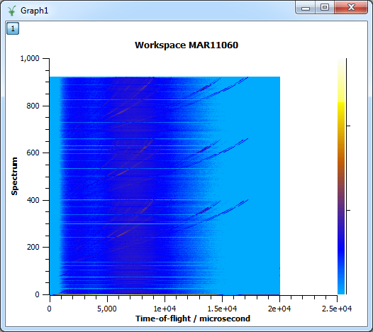
- Right click the workspace in the workspace list and select “Colour
Fill Plot”. This will create a fairly boring blue display of the
data, because one spectrum contains much higher counts than any of
the other spectra, and the color scale has adjusted accordingly.
- To make the colour fill plot more sensitive to its smaller features,
right-click on the plot and select “Colour Bar->Log Scale”.
- Finally, right-clicking on the colour bar and selecting ‘Rescale to
show all’ will give a more meaningful result:
Plotting from the Matrix View
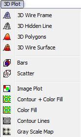
As long as this matrix is in focus, the MantidPlot menubar will contain
a menu called “3D Plot”. This contains many options for plotting full
datasets. The “Color Fill” option is one of the most useful among them.
Changing the Colour Map
There are several colour maps to choose from that are already installed
with Mantid:
- Double-click within the data of the plot (or right-click and select
“Properties”).
- In the “Plot Details” dialog that appears select “Layer Details” in
the left-hand pane.
- Select “Custom Color Map” in “Colors” tab, click the “Select
ColourMap” button, and select any of the colour map files.
Creating Your Own Colour Map
If you don’t like any of the colour maps you can create your own. The
files are just 256 entries of Red, Green and Blue values (0-255 for
each).
...
120 136 260
124 140 260
128 144 260
128 144 260
132 148 260
136 152 260
140 152 260
140 156 211
144 160 211
148 160 211
148 164 211
152 168 211
156 168 211
160 172 211
...
Contour Lines
You can plot contour lines onto your colour maps.
- Double-click within the data of the plot (or right-click and select
“Properties”).
- In the “Plot Details” dialog that appears select “Layer details” in
the left hand pane.
- Select the “Contour Lines” tab.
- Here you can set the values for the contours; the pen contour, line
thickness, etc. according to the “Plot Details” dialog example shown
- Click “OK” and the contour lines will appear on your plot:
Spectrum Viewer
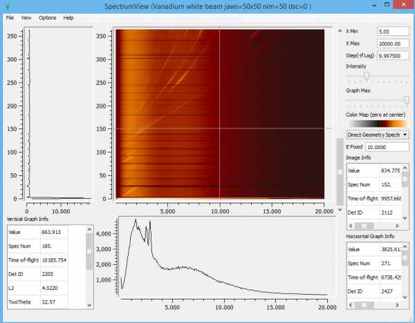
The Spectrum viewer is a useful way to investigate 2D image data. You
can rapidly look through the spectrum and bin data for any point in the
2D map. To launch the Spectrum Viewer just right-click on the MAR11060
Workspace and select ‘Show Spectrum Viewer’:


