The usual buttons on the Plot Toolbar: 
We will cover use of the Fitting Tab later…
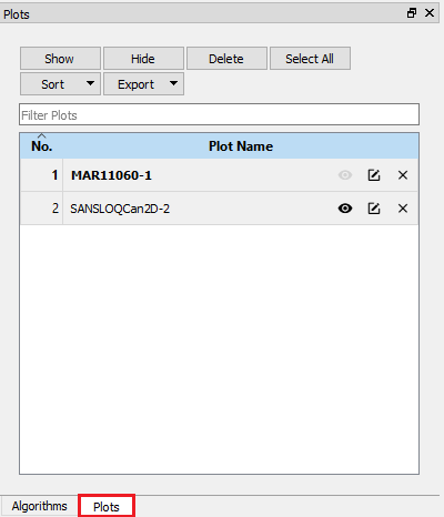
To show this window you may have to click on the Plots tab highlighted in Red.
The Plots Window great tool for organising your plots. It allows you to Show, Rename, Delete, Search for and Export Plots. It becomes very useful when you produce many plots and are struggling to find the one that you want!
Many aspects of these graphs can be adjusted to fit how you want to display the data.
Double-click on the item you want to change can edit:
Right-clicking on the centre of the Plot you can:
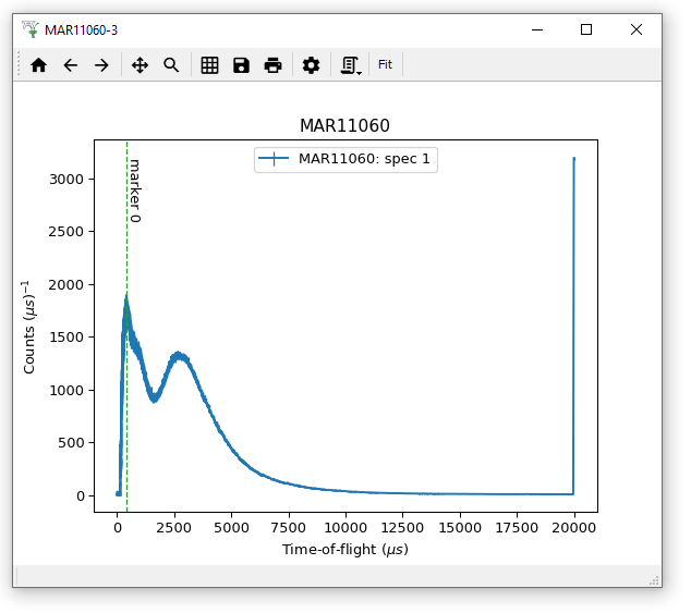
Plot a 1D spectrum from the MARI or EMU workspaces we have used before and have a go at adjusting these plotting options. If you create a marker, have a go at dragging it and editing it!
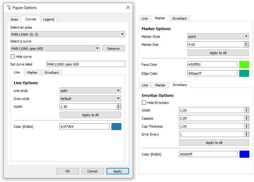
You have already seen the Figure Options Menu for Colorfill plots. For both Colorfill and normal 1D plots, you can use the Axes tab to edit the labels and Scales of the different Axes. Just as the “Images” tab was the most useful menu for Colorfill plots, for 1D plots this is the “Curves” tab. As shown above it is possible to edit the Color, Style and Width of a Line, add Markers and change their size and color, and show Error bars with options such as Capsize and Frequency of Errorbars (Error every how many points).
Please have a play with these options to see what you can do. For instance if you wish to change the label of a curve in the Legend, then edit the “Set curve label” entry on the Curves tab. Then on the Legend tab you will see Color and Font options.