Plotting All Spectra
We have previously seen how to plot one or more rows from a dataset.
Here we will show how to visually inspect entire datasets.
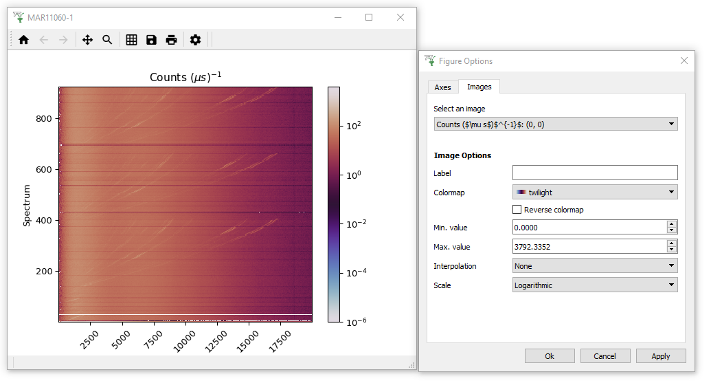
- Reload the MAR11060 dataset, but this time with no SpectraMin/Max limits.
- Right click the workspace in the workspace list and select “Plot >
Colorfill”. This will create a fairly boring purple display of the
data, because one spectrum contains much higher counts than any of
the other spectra, and the color scale has adjusted accordingly.
- To make the colour fill plot more sensitive to its smaller features,
open the Plot Options Menu by clicking on the Gear Icon. Click on the Images Tab of this menu and adjust the Scale to “Logarithmic” and click “Apply”. (Note you could have changed the scale by right-clicking on the plot image and setting “Color bar” to “Log”)
- While you are here feel free to change the other Figure options to see what is possible! I personally like to change the Colormap to “twilight”.
If you would like to create your own colormap, there is more information here.

