Basic 1D, 2D and 3D Plots#
plotSpectrum and plotBin#
Right-clicking a workspace from the Workspaces Toolbox and selecting Show Data creates a Data Matrix, which displays the underlying data in a worksheet.
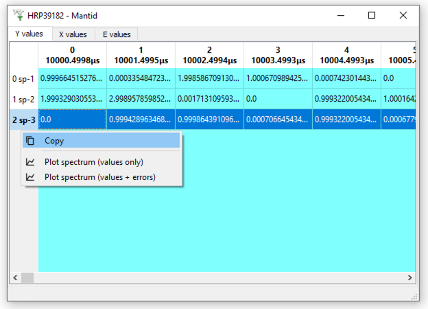
Right clicking on a row or a column allows a plot of that spectrum or time bin, which can also be achieved in Python using the plotSpectrum() or plotBin() functions, e.g.
from matplotlib.container import ErrorbarContainer

RawData = Load("MAR11015")

graph_spec = plotSpectrum(RawData, 0)
graph_time = plotBin(RawData, 0)

# Verify no errorbars added to plots
graph_spec_has_errorbars = any(isinstance(c, ErrorbarContainer) for c in graph_spec.axes[0].containers)
graph_time_has_errorbars = any(isinstance(c, ErrorbarContainer) for c in graph_time.axes[0].containers)

print(f"The spectrum graph contains errorbars - {graph_spec_has_errorbars}")
print(f"The time-of-flight graph contains errorbars - {graph_time_has_errorbars}")
Output:
The spectrum graph contains errorbars - False
The time-of-flight graph contains errorbars - False
To include error bars on a plot, there is an extra argument that can be set to ‘True’ to enable them, e.g.
from matplotlib.container import ErrorbarContainer

RawData = Load("MAR11015")

graph_spec = plotSpectrum(RawData, 0, error_bars=True)
graph_time = plotBin(RawData, 0, error_bars=True)

# Verify errorbars added to plots
graph_spec_has_errorbars = any(isinstance(c, ErrorbarContainer) for c in graph_spec.axes[0].containers)
graph_time_has_errorbars = any(isinstance(c, ErrorbarContainer) for c in graph_time.axes[0].containers)

print(f"The spectrum graph contains errorbars - {graph_spec_has_errorbars}")
print(f"The time-of-flight graph contains errorbars - {graph_time_has_errorbars}")
Output:
The spectrum graph contains errorbars - True
The time-of-flight graph contains errorbars - True
For setting scales, axis titles, plot titles etc. you can use:
import matplotlib.pyplot as plt

RawData = Load("MAR11015")
plotSpectrum(RawData, 1, error_bars=True)

# Get current axes of the graph
fig, axes = plt.gcf(), plt.gca()

plt.yscale('log')

# Rescale the axis limits
axes.set_xlim(0,5000)
axes.set_ylim(0.001,1500)

# Change the labels
axes.set_xlabel(r'Time-of-flight ($\mu s$)')
axes.set_ylabel(r'Counts ($\mu s$)$^{-1}$')

# Add legend entries
axes.legend(['Good Line'])

# Give the graph a modest title
plt.title("My Wonderful Plot", fontsize=20)

# Verify the scale, legend, axis limits and labels
print(f"The yscale is - {axes.get_yscale()}")
print(f"The x-limits are - [{float(axes.get_xlim()[0])}, {float(axes.get_xlim()[1])}]")
print(f"The y-limits are - [{float(axes.get_ylim()[0])}, {float(axes.get_ylim()[1])}]")
print(f"The x-axis label is - {axes.get_xlabel()}")
print(f"The y-axis label is - {axes.get_ylabel()}")
print(f"The plot title is - {axes.get_title()}")
print(f"The plot legend is - {axes.get_legend().get_texts()[0].get_text()}")
Output:
The yscale is - log
The x-limits are - [0.0, 5000.0]
The y-limits are - [0.001, 1500.0]
The x-axis label is - Time-of-flight ($\mu s$)
The y-axis label is - Counts ($\mu s$)$^{-1}$
The plot title is - My Wonderful Plot
The plot legend is - Good Line
Multiple workspaces/spectra can be plotted by providing lists within the plotSpectrum() or plotBin() functions, e.g.
RawData1 = Load("MAR11015")
RawData2 = Load("MAR11060")

# Plot multiple spectra from a single workspace
graph_spec1 = plotSpectrum(RawData1, [0,1,3])

# Plot a spectrum from different workspaces
graph_spec2 = plotSpectrum([RawData1,RawData2], 0)

# Plot multiple spectra across multiple workspaces
graph_spec3 = plotSpectrum([RawData1,RawData2], [0,1,3])

# Verify the number of spectra in plots
print(f"The graph_spec1 plot contains {len(graph_spec1.axes[0].lines)} spectra")
print(f"The graph_spec2 plot contains {len(graph_spec2.axes[0].lines)} spectra")
print(f"The graph_spec3 plot contains {len(graph_spec3.axes[0].lines)} spectra")
Output:
The graph_spec1 plot contains 3 spectra
The graph_spec2 plot contains 2 spectra
The graph_spec3 plot contains 6 spectra
To overplot on the same window:
RawData = Load("MAR11015")

# Assign original plot to a window called graph_spec
graph_spec = plotSpectrum(RawData, 0)

# Overplot on that window, without clearing it
plotSpectrum(RawData, 1, window=graph_spec, clearWindow=False)

# Verify the number of spectra in plot
print(f"The plot contains {len(graph_spec.axes[0].lines)} spectra")
Output:
The plot contains 2 spectra
2D Colourfill and Contour Plots#
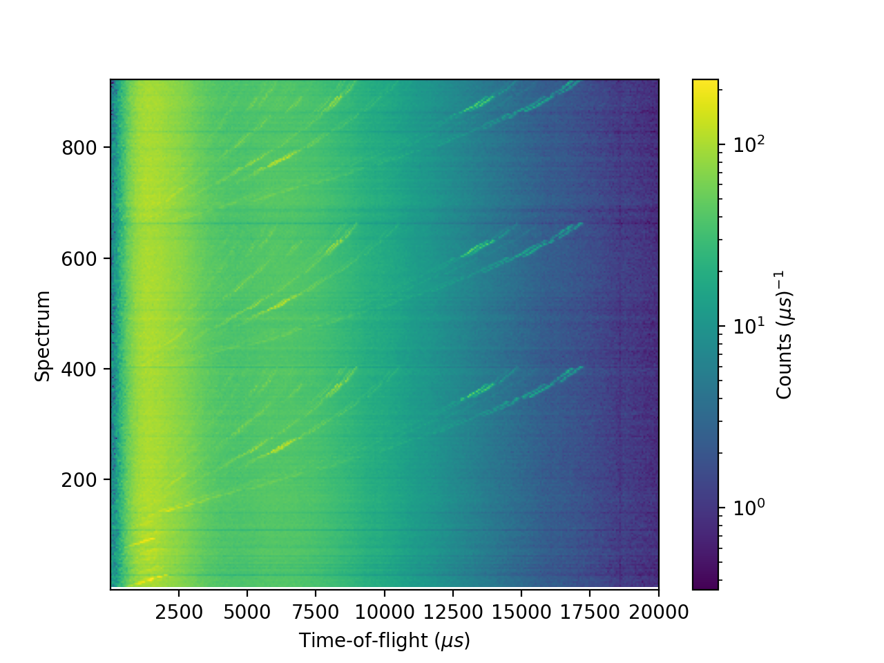
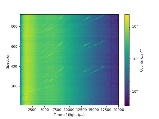
2D plots can be produced as an image or a pseudocolormesh (for a non-regular grid):
''' ----------- Image > imshow() ----------- '''

from mantid.simpleapi import *
import matplotlib.pyplot as plt
from matplotlib.colors import LogNorm

data = Load('MAR11060')

fig, axes = plt.subplots(subplot_kw={'projection':'mantid'})

# IMPORTANT to set origin to lower
c = axes.imshow(data, origin = 'lower', cmap='viridis', aspect='auto', norm=LogNorm())
cbar=fig.colorbar(c)
cbar.set_label(r'Counts ($\mu s$)$^{-1}$') #add text to colorbar
#fig.show()
(Source code, png, hires.png, pdf)
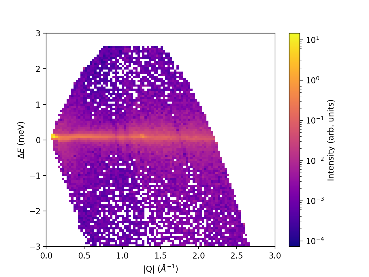
''' ----------- Pseudocolormesh > pcolormesh() ----------- '''

from mantid.simpleapi import *
import matplotlib.pyplot as plt
from matplotlib.colors import LogNorm

data = Load('CNCS_7860')
data = ConvertUnits(InputWorkspace=data,Target='DeltaE', EMode='Direct', EFixed=3)
data = Rebin(InputWorkspace=data, Params='-3,0.025,3', PreserveEvents=False)
md = ConvertToMD(InputWorkspace=data,QDimensions='|Q|',dEAnalysisMode='Direct')
sqw = BinMD(InputWorkspace=md,AlignedDim0='|Q|,0,3,100',AlignedDim1='DeltaE,-3,3,100')

fig, ax = plt.subplots(subplot_kw={'projection':'mantid'})
c = ax.pcolormesh(sqw, cmap='plasma', norm=LogNorm())
cbar=fig.colorbar(c)
cbar.set_label('Intensity (arb. units)') #add text to colorbar
#fig.show()
(Source code, png, hires.png, pdf)

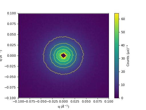
Contour lines can be overlayed on a 2D colorfill:
''' ----------- Contour overlay ----------- '''

from mantid.simpleapi import *
import matplotlib.pyplot as plt
import numpy as np

data = Load('SANSLOQCan2D.nxs')

fig, axes = plt.subplots(subplot_kw={'projection':'mantid'})

# IMPORTANT to set origin to lower
c = axes.imshow(data, origin = 'lower', cmap='viridis', aspect='auto')

# Overlay contours
axes.contour(data, levels=np.linspace(10, 60, 6), colors='yellow', alpha=0.5)

cbar=fig.colorbar(c)
cbar.set_label(r'Counts ($\mu s$)$^{-1}$') #add text to colorbar
#fig.show()
(Source code, png, hires.png, pdf)

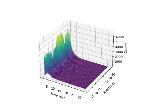
3D Surface and Wireframe Plots#
3D plots Surface and Wireframe plots can also be created:
''' ----------- Surface plot ----------- '''

from mantid.simpleapi import *
import matplotlib.pyplot as plt

data = Load('MUSR00015189.nxs')
data = mtd['data_1'] # Extract individual workspace from group

fig, ax = plt.subplots(subplot_kw={'projection':'mantid3d'})
ax.plot_surface(data, cmap='viridis')
#fig.show()
(Source code, png, hires.png, pdf)

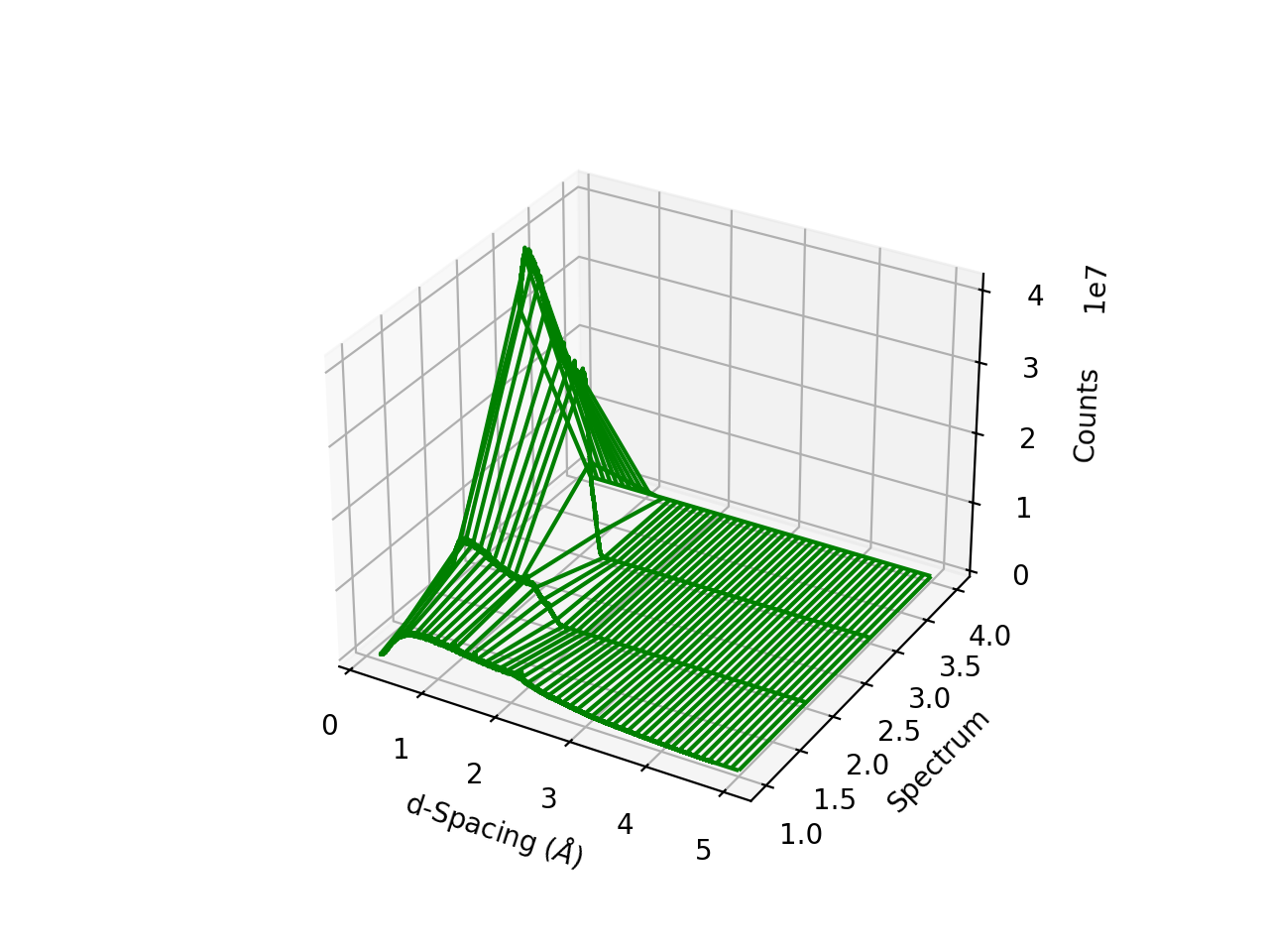
''' ----------- Wireframe plot ----------- '''

from mantid.simpleapi import *
import matplotlib.pyplot as plt

data = Load('164198.nxs')
data=ExtractSpectra(data, XMin=470, XMax=490, StartWorkspaceIndex=260, EndWorkspaceIndex=270)

fig, ax = plt.subplots(subplot_kw={'projection':'mantid3d'})
ax.plot_wireframe(data, color='green')
#fig.show()
(Source code, png, hires.png, pdf)
See here for custom color cycles and colormaps