Formatting Plots with a script#
Sometimes the easiest way to find out how to control part of a plot with Matplotlib is to search online for their documentation ! Below are some useful commands and a handful of links
General#
Required imports:
from mantid.simpleapi import *
import matplotlib.pyplot as plt
Access a workspace,loaded in the Workspace Toolbox, inside a script:
ws = mtd['ws']

#or you could use:
from mantid.api import AnalysisDataService as ADS
ws = ADS.retrieve('ws')
Create a Figure and access its Axes for plotting:
fig, axes = plt.subplots(subplot_kw={'projection': 'mantid'})
(including the Mantid projection allows for plotting in the Mantid way, such as selecting a SpectrumNumber)
Actually plot the 1st spectrum of the workspace “ws” and control many options:
axes.plot(ws, specNum=1, color='red', label='spec 1 - ws', linewidth=1.0, linestyle='--', drawstyle='steps', marker = 'x')
Add a legend containing the plotted data labels:
plt.legend()
Adjust the scale to logarithmic, or the axis limits:
axes.set_yscale('log')
axes.set_xlim(0.0, 80.)
# x and y can be swapped to alter the other axis
Add a title:
axes.set_title("My Wonderful Plot", fontsize=20, verticalalignment='bottom')
Add axis labels:
axes.set_xlabel(r'Time-of-flight ($\mu s$)'), axes.set_ylabel(r'Counts ($\mu s$)$^{-1}$')
Plotting with Errorbars#
Simply use “errorbar” instead of “plot”:
axes.errorbar(ws, specNum=3, capsize=2.0, label='spec 3', linewidth=1.0)
Tick Marks and Grid lines#
Add minor tick marks, here to the x-axis:
from matplotlib.ticker import (MultipleLocator, AutoMinorLocator)
axes.xaxis.set_minor_locator(MultipleLocator(5)) # minor ticks every 5 units
#axes.xaxis.set_minor_locator(AutoMinorLocator()) # python decides for you
Edit tick options such as direction in/out:
axes.tick_params(which='minor', width = 0.5, length=4, color='b', direction='in', top='on')
Even add gridlines :
axes.grid(True, which = 'both', axis = 'both') # major/minor, x/y
Notice how gridlines are linked to the axis ticks:
axes.tick_params(which='minor', grid_color='r', grid_alpha=0.5)
axes.tick_params(which='major', grid_color='b')
Fonts#
Alter the font on labels, axes, titles:
plt.rcParams.update({"font.family": "sans-serif", "font.sans-serif": "<Insert Font Here>"})

axes.yaxis.label.set(fontsize = 12, fontstyle = 'italic')
Note that the fonts available is system dependent - and you can find available fonts here .
Alternatively, you can set a title or label to have certain font properties:
axes.set_xlabel(r'Time-of-flight ($\mu s$)', fontsize = 12, fontstyle = 'italic', fontweight = 'bold', fontfamily='serif')
Subplots and Inset plots#
Create a tiled plot (subplot)
fig, axes = plt.subplots(ncols=2, nrows=2, subplot_kw={'projection': 'mantid'})
# You've created 2x2 arrangement of plots, now plot in them:
axes[0][0].plot(ws, specNum=1)
axes[0][1].plot(ws, specNum=2)
axes[1][0].plot(ws, specNum=3)
axes[1][1].plot(ws, specNum=5)
#for subplots it is useful to include the following line
plt.tight_layout()
Add an inset plot using the mantid projection (without it ):
ax_sub = fig.add_axes([0.50, 0.50, 0.3, 0.25],projection='mantid') #[left, bottom, width, height]
ax_sub.plot(ws, specNum=5)
Generate a Script#
On a 1D or tiled plot in workbench, click the generate a script button  which will give more insight into the options for plotting from a script.
NOTE It is very possible that the Generate a Script and Figure Options buttons on the plot toolbar will not work when that plot has been produced by a complex script.
Useful links#
For further info, including code for producing 2D colorfill plots see:
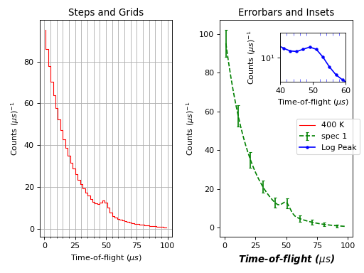
Example Script#
from mantid.simpleapi import *
import matplotlib.pyplot as plt
from matplotlib.ticker import (MultipleLocator, AutoMinorLocator)

#Example data
exp_decay = CreateSampleWorkspace(Function='User Defined',
                                  UserDefinedFunction='\
                                  name=ExpDecay,Lifetime = 20,Height = 200;name=Gaussian,\
                                  PeakCentre=50, Height=10, Sigma=3',
                                  XMax=100, BinWidth=2)

#Create figure and axes
fig, axes = plt.subplots(ncols=2,nrows=1,subplot_kw={'projection': 'mantid'})

# Plot with errorbars on the left set of axes
axes[0].plot(exp_decay, specNum=1, color='red', label='400 K', linewidth=1.0, drawstyle='steps')
axes[0].set_title('Steps and Grids')
axes[0].xaxis.set_minor_locator(AutoMinorLocator())
axes[0].grid(True, which = 'both', axis = 'both') # major/minor, x/y

# Add an inset, use trial and error to find the right location
inset = fig.add_axes([0.77, 0.70, 0.18, 0.18],projection='mantid') #[left, bottom, width, height]
inset.plot(exp_decay, specNum=5, color='blue', label='Log Peak', marker ='.')
plt.yscale('log') #only affects the most recently called axes
inset.set_xlim(40, 60), inset.set_ylim(5, 20)
inset.xaxis.set_minor_locator(AutoMinorLocator()) #inserts 5 minor b/w each major
inset.tick_params(which='minor', width = 0.5, length=4, color='b', direction='in', top='on')

#Plot on the right set of axes
axes[1].errorbar(exp_decay, specNum=1, capsize=2.0, errorevery=5, color='green', label='spec 1', linestyle='--')
axes[1].set_xlabel('Time-of-flight ($\mu s$)', fontsize = 12, fontstyle = 'italic', fontweight = 'bold')
axes[1].set_ylabel('Counts ($\mu s$)$^{-1}$')
axes[1].set_title('Errorbars and Insets')

#Use tight layout for subplots and create a legend
plt.tight_layout()
fig.legend(loc='center right')

#fig.show()
(Source code, png, hires.png, pdf)
Other Plotting Documentation