\(\renewcommand\AA{\unicode{x212B}}\)
This section allows the user to:
Table of Contents
Workspaces hold the data in Mantid. They come in several forms, but the most common is the Matrix Workspace which represents XYE data for one or more spectra. In MantidWorkbench the data contained in a workspace can viewed as a matrix or a table, and graphed in many ways including Line graphs, and ‘colourful’ (contour) plots.
Interaction with workspaces is typically through an interface. Matrix Workspaces are typically created by executing one of Mantid’s ‘Load’ algorithms or are the output of algorithms which take a Matrix Workspace as input.
In addition to data, workspaces hold a workspace history, which details the algorithms which have been run on this workspace.
The Analysis Data Service (ADS), by default is found on the left-hand side of the main MantidWorkbench window. When a muon data set is loaded via the GUI, the Matrix Workspaces are created automatically.
In general the muon analysis GUI hides workspaces from the user; however, an understanding of their functionality is sometimes useful to take advantage of some of the more advanced features of MantidWorkbench. In particular, for those seeking to develop a specialist analysis method, the GUI can be used for the initial data reduction, while user coded Python or C++ algorithms act on workspaces to process the final result. This type of hybrid workflow demonstrates the versatility of the MantidWorkbench interface.
Other types of object, such as Tables, Matrices and Notes, may be created through the MantidWorkbench interface. As these are not workspaces the Algorithms can’t directly be applied. However, Tables may be converted to either a Table or Matrix workspace through an option on the analysis menu for subsequent data processing.
Matrix Workspaces are typically created by executing one of Mantid’s ‘Load’ algorithms or are the output of algorithms which take a Matrix Workspace as input. In addition to data, workspaces hold a workspace history which lists the algorithms that have been applied to the data.
To load a raw data file without using the Mantid Analysis GUI, and examine its content:
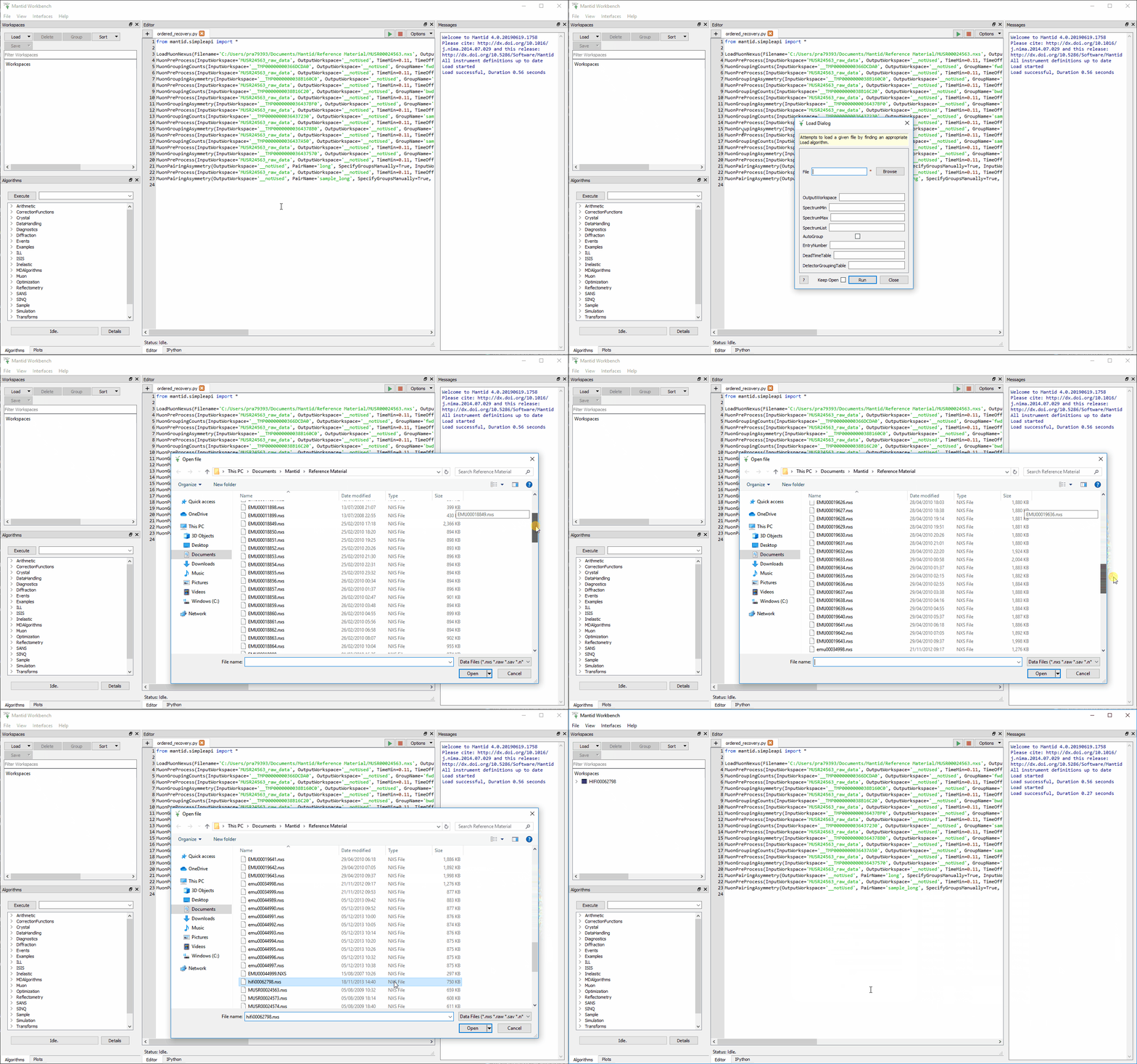
Figure 4: Loading the HIFI00062798.nxs data file into Mantid using the Browse button instead of the Analysis GUI.
Click on the arrow beside the file name – this allows information about the format of data file to be viewed. The following should be seen in the Workspace List pane to the right of the screen.
It can be seen that a workspace called HIFI00062798 has been created. It
However, the NeXuS format allows a lot more information be stored in a data file than that listed above. As an example right click on the file name and select Show Sample Logs. A list of experiment and instrument parameters that have been logged during a measurement, from magnetic fields to sample temperatures, appears.
To interrogate any of these logs double click on the Name, try this with Temp_Cryostat as shown in figure 5.
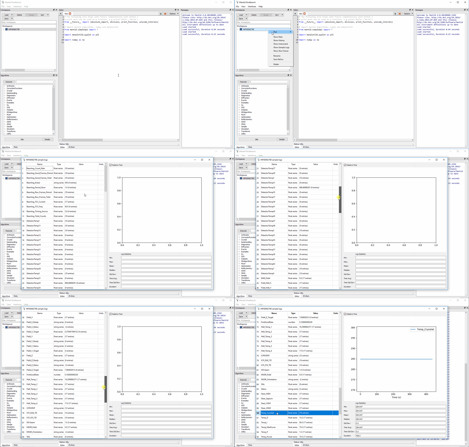
Figure 5: How to open the Sample Logs from the workspace and inspecting Temp_Cryostat.
As mentioned, the HIFI00062798.nxs workspace holds within it raw positron counts / bin for each individual HiFi detector. To examine the data collected in a single detector, right click on HIFI00062798 and select “Plot>Spectrum…” .
On HiFi, as way of example, there are 64 detectors hence ID numbers: 1-64 (1-32 = upstream detectors, 33-64 = downstream detectors.
Enter a detector (ID) number of choice and click OK to plot the associated raw data. This process is illustrated below.
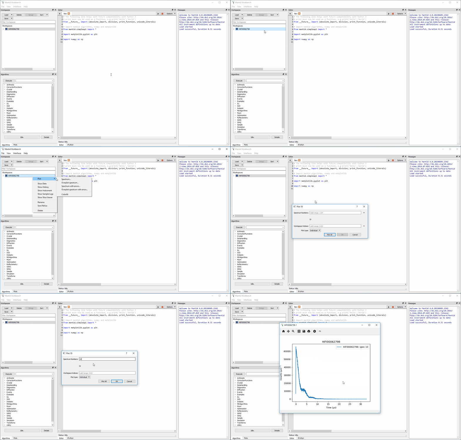
Figure 6: How to plot an individual detector spectrum. This example shows spectrum 10 for the HIFI00062798 dataset.
For information:
To export the data contained within any listed workspace, the Algorithms tab at the bottom of the workspace list pane can be used.
Figure 7: The Algorithms Options
Follow the instructions below to try this
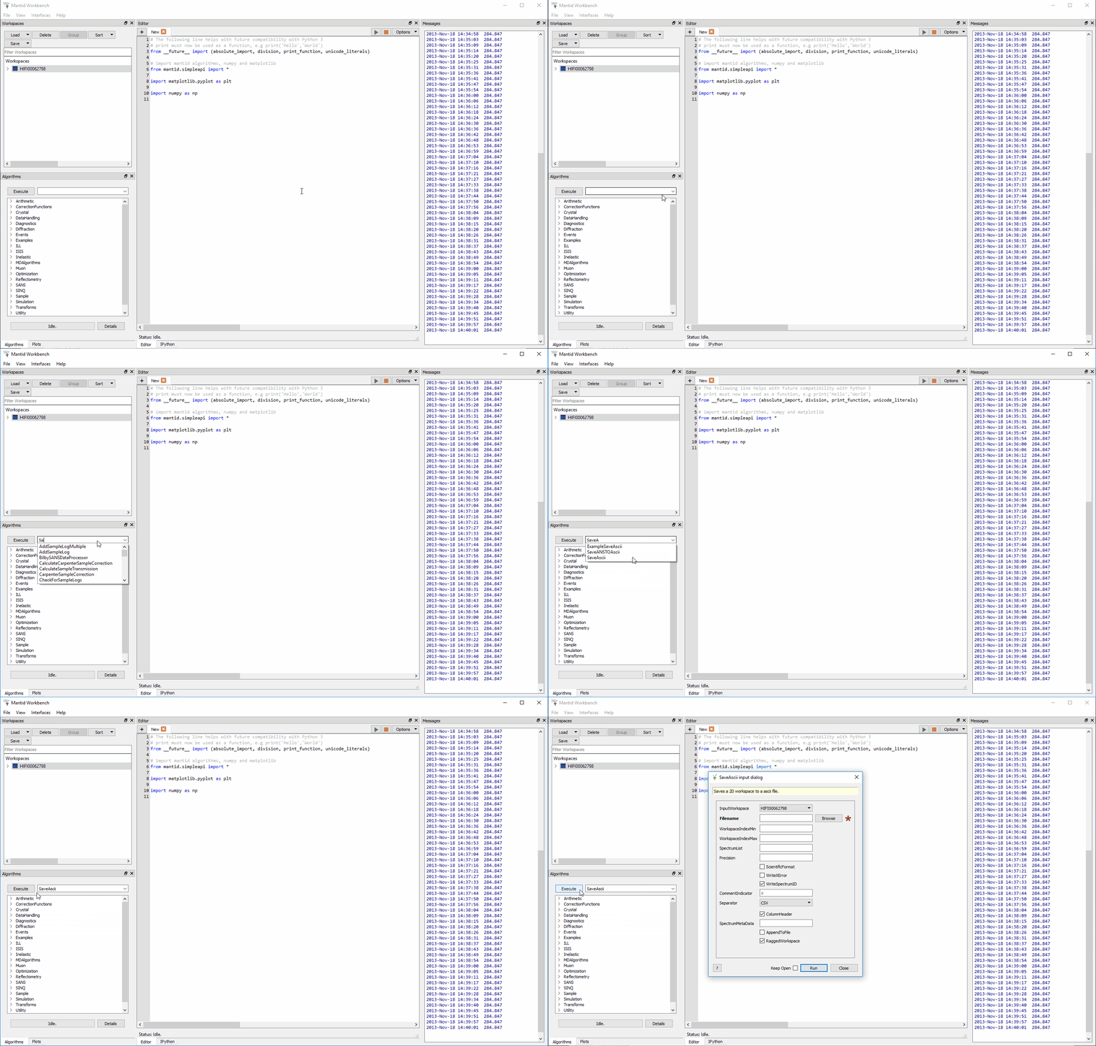
Figure 8: Where to find the SaveAscii Algorithm.
Overlaying data plots can be useful when trying to compare two different sets of data simultaneously by having them on one individual plot. Overlaying data can be done by simply clicking and dragging a workspace onto an existing plot, or can be done via the Overlaying Data option from the workspace pane.
To try this follow these instructions:
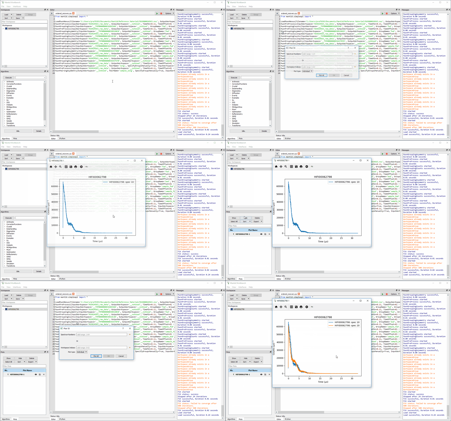
Figure 9: How to overlay one plot (detector 20) onto another (detector 10).
The plot style a data set can be selected using the gear icon at the top of the plot window, this will open the Figure options menu.
To demonstrate changing a plot’s markers and curve colour follow these instructions:
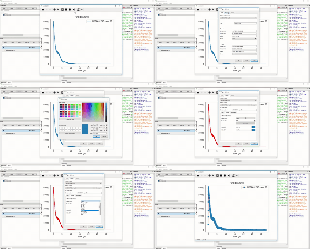
Figure 10: How to change the line colour and marker style of a plot.
One can also change the axis settings, such as the maximum and minimum values, and plotting against a logarithmic scale. The axis limits can be changed either through the Figure options menu, or by double clicking on the relevant axis, while other . See the instructions below for an example on how to change the X-Axis limits and set the Y-Scale to logarithmic.
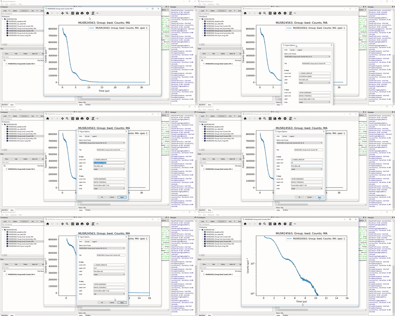
Figure 11: Changing the X-Axis scale limits and setting the Y-Axis to logarithmic settings using the Figure options menu.
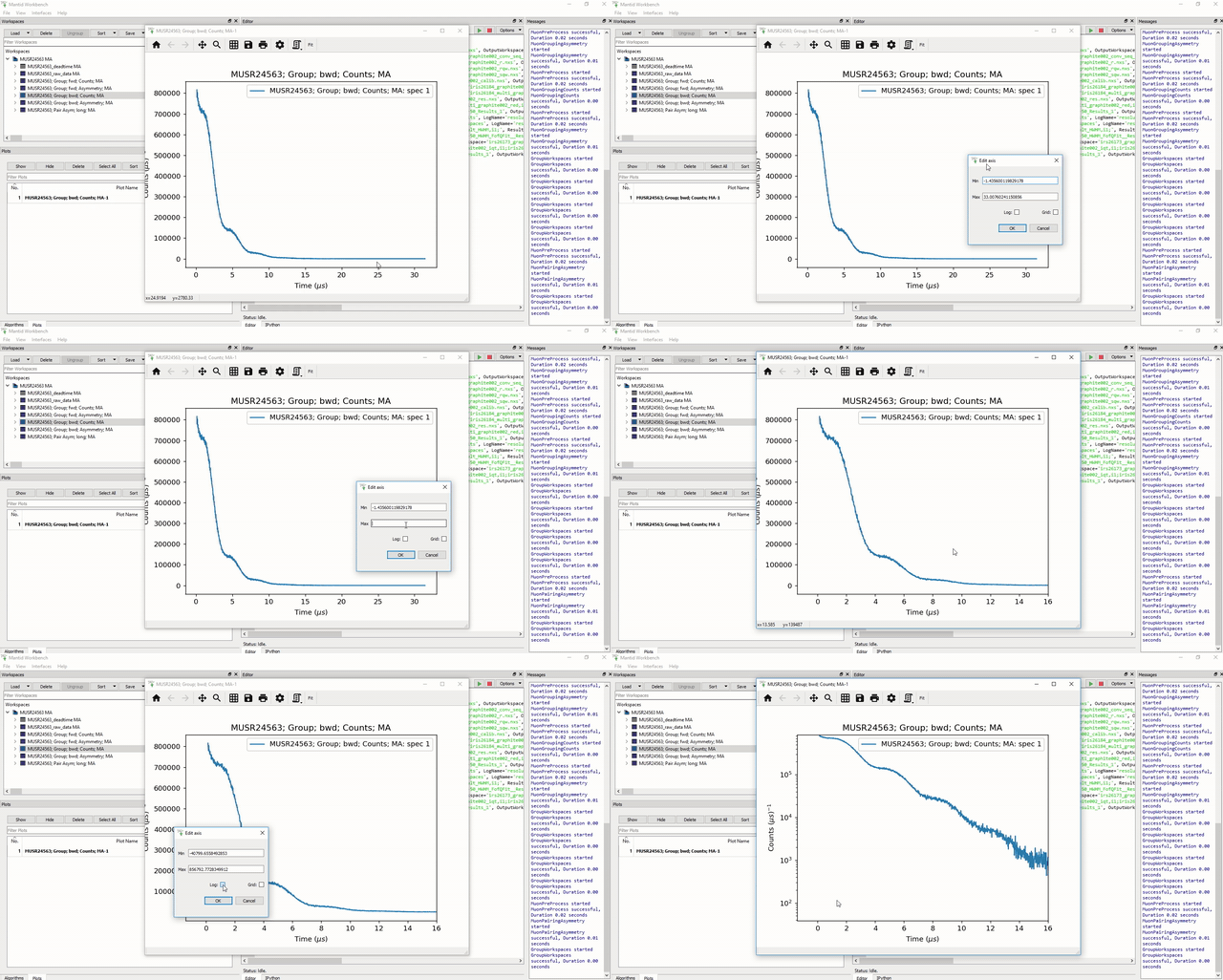
Figure 12: Changing the X-Axis scale limits and setting the Y-Axis to logarithmic using the Edit axis dialog. Note that if the scale limits include negative values when doing this, Mantid will automatically use a ‘symmetrical log’ scale, which allows for negative values by having a range around 0 where the scale is linear not logarithmic.