Displaying 2D Data#
Plotting All Spectra#
We have previously seen how to plot one or more rows from a dataset. Here we will show how to visually inspect entire datasets.
Reload the MAR11060 dataset, but this time with no SpectraMin/Max limits.
Right click the workspace in the workspace list and select “Plot > Colorfill”.
To make the colour fill plot more sensitive to its smaller features, open the Plot Options Menu by clicking on the Gear Icon. Click on the Images Tab of this menu and adjust the Scale to “Logarithmic” and click “Apply”. (Note you could have changed the scale by right-clicking on the plot image and setting “Color bar” to “Log”)
While you are here feel free to change the other Figure options to see what is possible! e.g. change the Colormap to one you prefer.
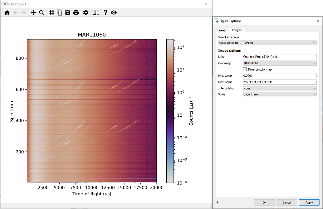
If you would like to create your own colormap, see Custom Colormap (MantidWorkbench).
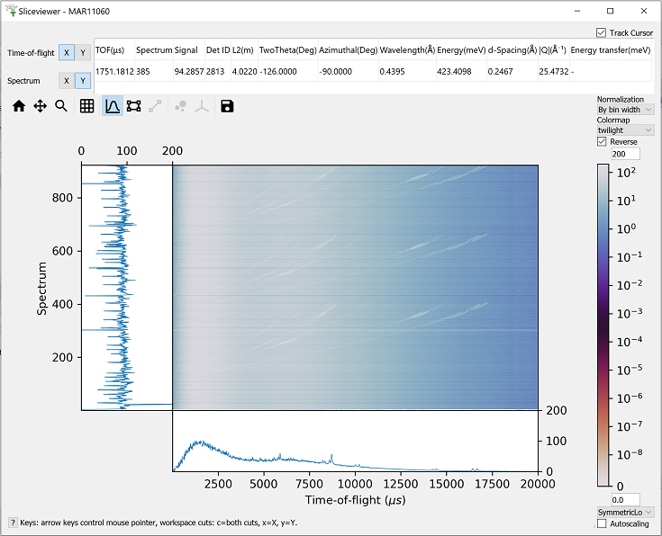
Slice Viewer#
This is a useful tool to investigate 2D image data. You can rapidly look through the spectrum and bin data, by hovering your mouse cursor over the 2D map.
Right-click on the loaded MAR11060 workspace and select ‘Show Slice Viewer’.
Change the scale of the colorbar in the drop-down menu (in the bottom right) to SymmetricLog10.
Change the Colorbar Maximum to 200.
Toggle the Lineplots ON, by clicking the graph toolbar button
 .
.Move your cursor around the plot to see the corresponding lineplots and cursor data.
Click the next toolbar button
 and mark out a region of interest.
The lineplots now display the axis data summed over this region of the image.
and mark out a region of interest.
The lineplots now display the axis data summed over this region of the image.
Slice Viewer also includes advanced features for multi-dimensional Single Crystal Diffraction data.
These advanced toolbar buttons  are disabled for 2D data. As a hint to
what is possible, create some fake 4D data by running these lines in the Script Editor in MantidWorkbench:
are disabled for 2D data. As a hint to
what is possible, create some fake 4D data by running these lines in the Script Editor in MantidWorkbench:
md_4D = CreateMDWorkspace(Dimensions=4, Extents=[-1,1,-1,1,-1,1,-10,10], Names="H,K,L,E", Units="U,U,U,V")
FakeMDEventData(InputWorkspace=md_4D, PeakParams='500000,0,0,0,0,3')
In the top left, set
Eas the Y-axis andLas the X-axis.Use the sliders to view the data at different points in the H and K dimensions.
You will notice that the peaks overlay toolbar button has been enabled. This requires an appropriate PeaksWorkspace but we will not go into any further detail in this course.