Workbench Plotting#
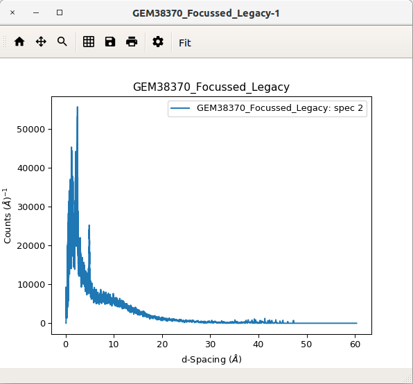
This is the window in which all plots will be shown. Within this window you can view, save, and edit your plots as well as fit functions to your plots using the fitting interactive tool.
Plotting in Workbench is carried out using Python’s Matplotlib package. Matplotlib provides several advantages: it is a large library containing many features, it is also widely used which means there is excellent documentation available and plenty of examples to work from. You can create a plot either using Matplotlib within your scripts or right-clicking a workspace and selecting to plot.
For more help using Matplotlib within Mantid you can read the Introduction to Matplotlib in Mantid.
Plot Window Context Menu#
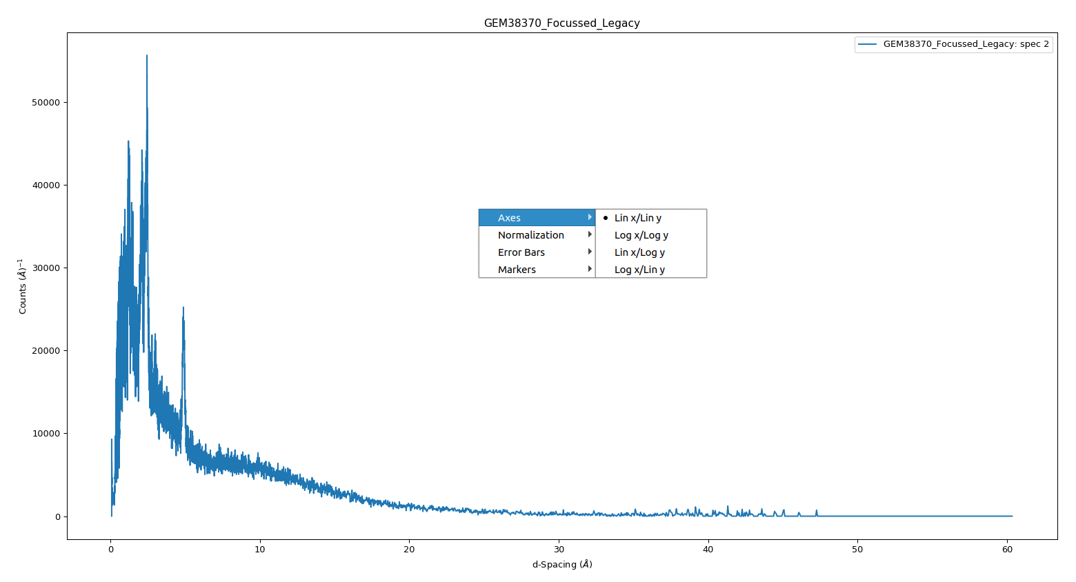
Right-clicking within your plot will open the plot context menu. From this menu you can:
set the axes’ scales to linear or logarithmic.
add or remove bin width normalization (by default the data is normalized)
add and edit vertical/horizontal markers
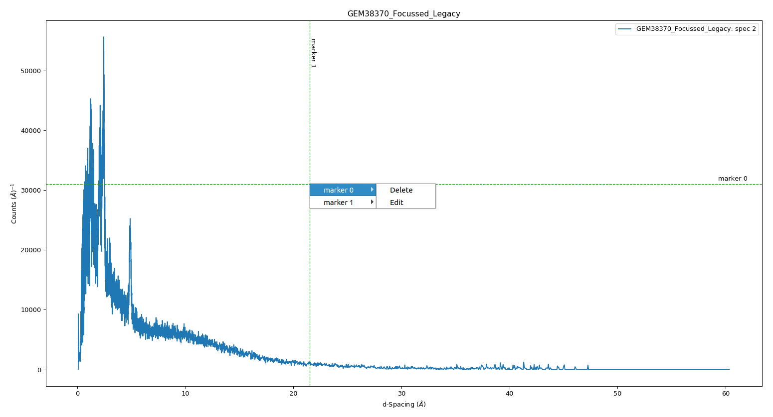
When right clicking on top of a marker the menu will be replaced by one allowing the deletion or editing of the marker. To edit a marker the following window will appear, allowing to change position, name, line colour and line style.
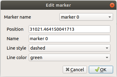
Figure Options#
Selecting the settings icon in the plot window brings up the figure options window. There are two tabs within this window: axes options and curve options.
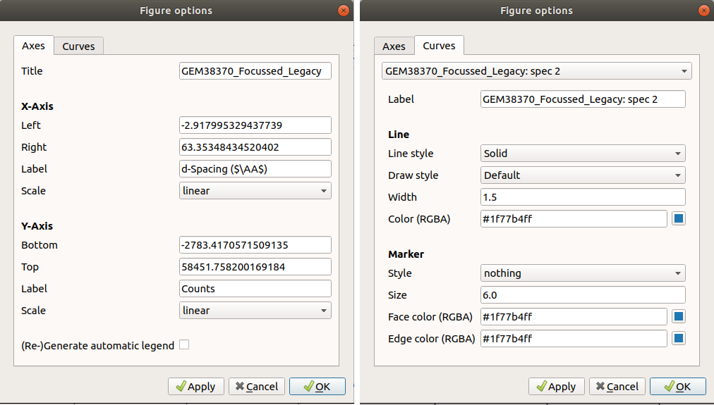
In the “Axes” tab you can change the figure’s title, the axes limits and scale and change the axes labels. There is also the “(Re-)Generate automatic legend” tick box at the bottom, make sure this is ticked if you want to update your legend. The apply all button applies the current settings to all axes in the figure.
In the “Curves” tab you can change the properties of curves within your figure. The drop down menu at the top gives a list of the curves present in the figure, you can select the curve you want to modify. From here you can change the style and colour of the curve, as well as add point markers and change its label. To make sure the legend is updated ensure you have ticked the “(Re-)Generate automatic legend” box on the “Axes” tab.
You can set default settings using Matplotlib’s rcParams for a guide to
this see Change Matplotlib Defaults.
Fitting#
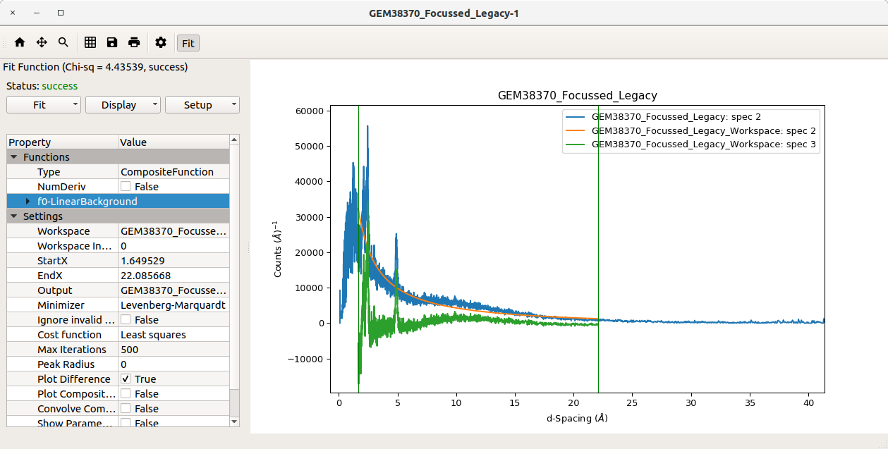
The “Fit” option in the plot window toolbar activates the interactive fitting tool. From here you can add functions to fit to, choose the bounds to fit within and choose a fitting algorithm. For more on fitting see Fitting Overview.